Assumption Checking of LDA vs. QDA – R Tutorial (Pima Indians Data Set)
In this blog post, we will be discussing how to check the assumptions behind linear and quadratic discriminant analysis for the Pima Indians data. We also built a Shiny app for this purpose. The code is available here. Let’s start with the assumption checking of LDA vs. QDA.
What we will be covering:
- Data checking and data cleaning
- Checking assumption of equal variance-covariance matrices
- Checking normality assumption
In the next blog post, we will be implementing the linear discriminant algorithms.

Assumption Checking of LDA vs. QDA – Data Checking and Data Cleaning
Before we do some assumption checking of LDA vs. QDA, we have to load some libraries and then read in the data.
library(heplots)
library(ggplot2)
library(dplyr)
library(gridExtra)

diabetes <- read.csv("diabetes.csv")
head(diabetes, 3)

##   Pregnancies Glucose BloodPressure SkinThickness Insulin BMI
## 1           6     148            72            35       0 33.6
## 2           1      85            66            29       0 26.6
## 3           8     183            64             0       0 23.3
##   DiabetesPedigreeFunction Age Outcome
## 1                    0.627  50      1
## 2                    0.351  31      0
## 3                    0.672  32      1
dim(diabetes)

## [1] 768 9

diabetes <- dplyr::rename(diabetes, Pedigree = DiabetesPedigreeFunction)
When examining the data frame, we notice that there are some people with an insulin level of zero. Insulin levels might be very important in determining if someone has diabetes or not and an insulin level of 0 is not possible. Therefore, we are deciding to throw away all observations that have an insulin level of 0.
ins.zero <- subset(diabetes, Insulin == 0)
nrow(ins.zero)

## [1] 374

nrow(diabetes)
## [1] 768
Given that we only have 768 observations, it hurts very much that we have to throw away almost half of our observations. One could do the analysis without Insulin or impute the missing insulin level based on the fact that someone has diabetes or not. In addition to the zero values in the insulin column, there are also zero values in columns two to six. We are going to remove these values as well.
# replaces all zero values from column two to six with NA
diabetes[, 2:6][diabetes[, 2:6] == 0] <- NA

# now we omit all NA values
diabetes <- na.omit(diabetes)

# at the end, we are left with 392 observations for our analysis
nrow(diabetes)

## [1] 392

# we substitute ones with "Diabetes" and zeros with "No Diabetes"
diabetes$Outcome <- ifelse(diabetes$Outcome == 1, "Diabetes", "No Diabetes")
Assumption Checking of LDA vs. QDA – Checking Assumption of Equal Variance-Covariance matrices
We want to use LDA and QDA in order to classify our observations into diabetes and no diabetes. From this post, we know our assumptions of LDA and QDA so let’s check them.
Checking the Assumption of Equal Variance
First, in order to get a sense of our data and if we have equal variances among each class, we can use boxplots.
plot <- list()

box_variables <- c("Pregnancies", "Age", "Glucose")
for(i in box_variables) {
    plot[[i]] <- ggplot(diabetes,
                        aes_string(x = "Outcome",
                                   y = i,
                                   col = "Outcome",
                                   fill = "Outcome")) +
    geom_boxplot(alpha = 0.2) +
    theme(legend.position = "none") +
    scale_color_manual(values = c("blue", "red")) +
    scale_fill_manual(values = c("blue", "red"))
}

do.call(grid.arrange, c(plot, nrow = 1))

The three different boxplots show us that the length of each plot clearly differs. This is an indication of non-equal variances.
We can examine further the assumption of homogeneity of variance-covariance matrices by plotting covariance ellipses.
Checking the Assumption of Equal Covariance Ellipse
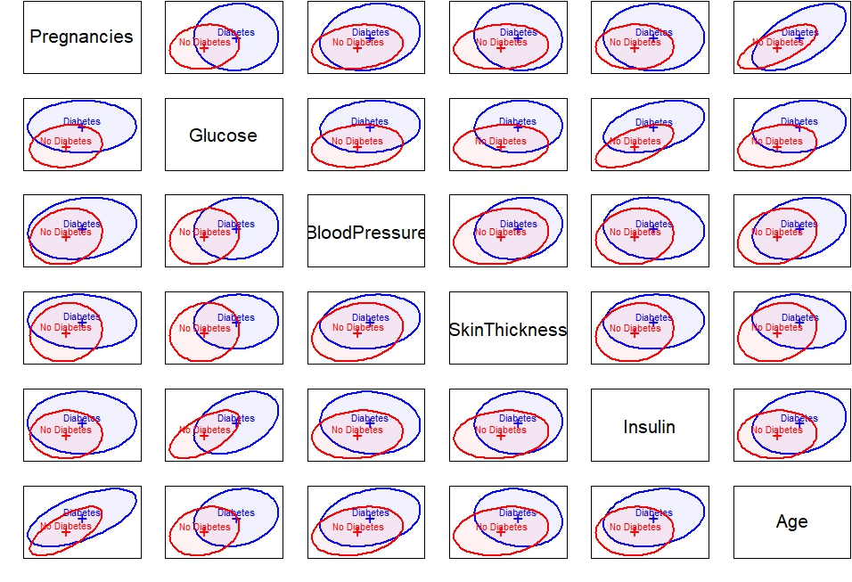
heplots::covEllipses(diabetes[,1:8],
                     diabetes$Outcome,
                     fill = TRUE,
                     pooled = FALSE,
                     col = c("blue", "red"),
                     variables = c(1:5, 8),
                     fill.alpha = 0.05)
ggplot(diabetes, aes(x = Glucose, y = Insulin, col = Outcome)) +
    geom_point() +
    stat_ellipse() +
    scale_color_manual(values = c("blue", "red"))

From this scatter plot, we can clearly see that the variance for the diabetes group is much wider than the variance from the non-diabetes group. This is because the blue points have a wider spread. The red points in contrast do not have as wide of a spread as the blue points.
We are using the BoxM test in order to check our assumption of homogeneity of variance-covariance matrices.


# using columns 1 to 5 and 8
boxm <- heplots::boxM(diabetes[, c(1:5, 8)], diabetes$Outcome)
boxm

##
## Box's M-test for Homogeneity of Covariance Matrices
##
## data: diabetes[, c(1:5, 8)]
## Chi-Sq (approx.) = 121.31, df = 21, p-value = 4.112e-16
When are choosing our alpha to be 0.05 then from our result we can conclude that we have a problem of heterogeneity of variance-covariance matrices. The plot below gives information on how the groups differ in the components that go into Box’s M test.
plot(boxm)
The log determinants are ordered according to the sizes of the ellipses we saw in the covariance ellipse plots. This plot confirms the visualizations that we have ellipses of different sizes and therefore, no equal variance-covariance matrices. It is worth noting that the Box M test is sensitive and can detect even small departures from homogeneity.
As an additional check, we can perform a Levene test to check for equal variances.
leveneTest(Pregnancies ~ Outcome, diabetes)

## Levene's Test for Homogeneity of Variance (center = median)
## Df F value Pr(>F)
## group 1 28.653 1.481e-07 ***
## 390
## ---
## Signif. codes: 0 '***' 0.001 '**' 0.01 '*' 0.05 '.' 0.1 ' ' 1
From this test, we can see how the variances of the groups differ for Pregnancies. They also differ for the variables Age, Glucose, and Insulin (not shown).
leveneTest(BloodPressure ~ Outcome, diabetes)

## Levene's Test for Homogeneity of Variance (center = median)
##       Df F value Pr(>F)
## group 1   0.5761 0.4483
##       390
For BloodPressure, the variance seems to be equal. This is also the case for SkinThickness, and BMI (not shown).
diab.yes <- subset(diabetes, Outcome == "Diabetes")
diab.no <- subset(diabetes, Outcome == "No Diabetes")
Assumption Checking of LDA vs. QDA – Checking Assumption of Normality
With the following qqplots, we are checking that the distribution of the predictors is normally distributed within the diabetes group and non-diabetes group.
- Diabetes Group
variable_1 <- c("Pregnancies", "Glucose", "Insulin", "Age")

par(mfrow = c(2, 2))

for(i in variable_1) {

    qqnorm(diab.yes[[i]]); qqline(diab.yes[[i]], col = 2)

}

When looking at the distribution of Glucose, we can see that it is roughly normally distributed because the dots fall on the red line. We can see that the tails of the distribution are thicker than the tails from a normal distribution because the points deviate from the line at the left and at the right from the plot.
We can see that the distribution of the variable Pregnancies is not normally distributed because the points deviate from the line very much.
Insulin and Age are also not normally distributed. The curve pattern in the plot is in the shape of a bow which indicated skewing. The points are above the line, then below it, and then above it again. This indicated that the skewing is to the right.
variable_2 <- c("BMI", "SkinThickness", "BloodPressure", "Pedigree")

par(mfrow = c(2, 2))

for(i in variable_2) {

    qqnorm(diab.yes[[i]]); qqline(diab.yes[[i]], col = 2)

}

The variables SkinThickness and BloodPressure look like they are normally distributed. The down-swing at the left and up-swing at the right of the plot for the blood pressure variable suggests that the distribution is heavier-tailed than the theoretical normal distribution.
For the BMI variable, the points swing up substantially at the right of the plot. These points might be outliers but we cannot infer that by looking at these plots.
The distribution for the PedigreeFunction variable looks again right-skewed and not normally distributed.
If one wants to test for normality, the shapito.test function is an option. Here is an example of how to use it:
shapiro.test(diab.yes$SkinThickness)

##
## Shapiro-Wilk normality test
##
## data: diab.yes$SkinThickness
## W = 0.99547, p-value = 0.9571
The null hypothesis is that the data is normally distributed. Based on the results, we fail to reject the null hypothesis and conclude that the data is normally distributed for SkinThickness.
- Non-Diabetes Group
par(mfrow = c(2, 2))

for(i in variable_1) {

    qqnorm(diab.no[[i]]); qqline(diab.no[[i]], col = 2)

}

All variables do not seem to be normally distributed and all distributions seem to be right-skewed based on the bow shape of the points in all four plots.
par(mfrow = c(2, 2))

for(i in variable_2) {

    qqnorm(diab.no[[i]]); qqline(diab.no[[i]], col = 2)

}

BMI, SkinThickness, and BloodPressure seem to be roughly normally distributed whereas the PedigreeFunction has this bow shape which suggests it is right-skewed.
Another visualization technique is to plot the density of the predictors for each group. Through the plots below, we can detect if the predictors in each group are normally distributed and we can also check for equal variance.
plot <- list()

for(i in names(diabetes)[-9]) {

    plot[[i]] <- ggplot(diabetes, aes_string(x = i, y = "..density..", col = "Outcome")) +
                     geom_density(aes(y = ..density..)) +
                     scale_color_manual(values = c("blue", "red")) +
                     theme(legend.position = "none")
}

do.call(grid.arrange, c(plot, nrow = 4))

From the plots above we can conclude, that a lot of distributions are right-skewed and that the variance is often also different.
I hope you have enjoyed this post about the assumption checking of LDA vs. QDA and know why these algorithms behave differently for certain data sets.
In our next post, we are going to implement LDA and QDA and see, which algorithm gives us a better classification rate.
Comments (4)
Thanks for the step by step guide!
You are welcome 🙂
Noew this will help me eliminate LDA when am trying to compare different algorithm. this is much well done. am starting machine learning journey can i also find for Logistic regression?
No not yet, maybe I’ll write a blog post about it one day. I am glad you got some value out of it though