How to Selectively Place Text in ggplots with geom_text()
When I started learning ggplot I was very impressed by how easy it was to use it. However, it took me a long time to understand the package on a deeper level. In this tutorial, we will be covering how to place text in a ggplot graphic to add more information to our plots.
For this tutorial, we need to load the libraries below.
library(gapminder)
library(tidyverse)
library(ggrepel)
The gapminder data set looks like that:
## # A tibble: 1,704 x 6
##    country     continent  year lifeExp      pop gdpPercap
##    <fct>     <fct>     <int>   <dbl>    <int>     <dbl>
##  1 Afghanistan Asia       1952    28.8  8425333      779.
##  2 Afghanistan Asia       1957    30.3  9240934      821.
##  3 Afghanistan Asia       1962    32.0 10267083      853.
##  4 Afghanistan Asia       1967    34.0 11537966      836.
##  5 Afghanistan Asia       1972    36.1 13079460      740.
##  6 Afghanistan Asia       1977    38.4 14880372      786.
##  7 Afghanistan Asia       1982    39.9 12881816      978.
##  8 Afghanistan Asia       1987    40.8 13867957      852.
##  9 Afghanistan Asia       1992    41.7 16317921      649.
## 10 Afghanistan Asia       1997    41.8 22227415      635.
## # ... with 1,694 more rows
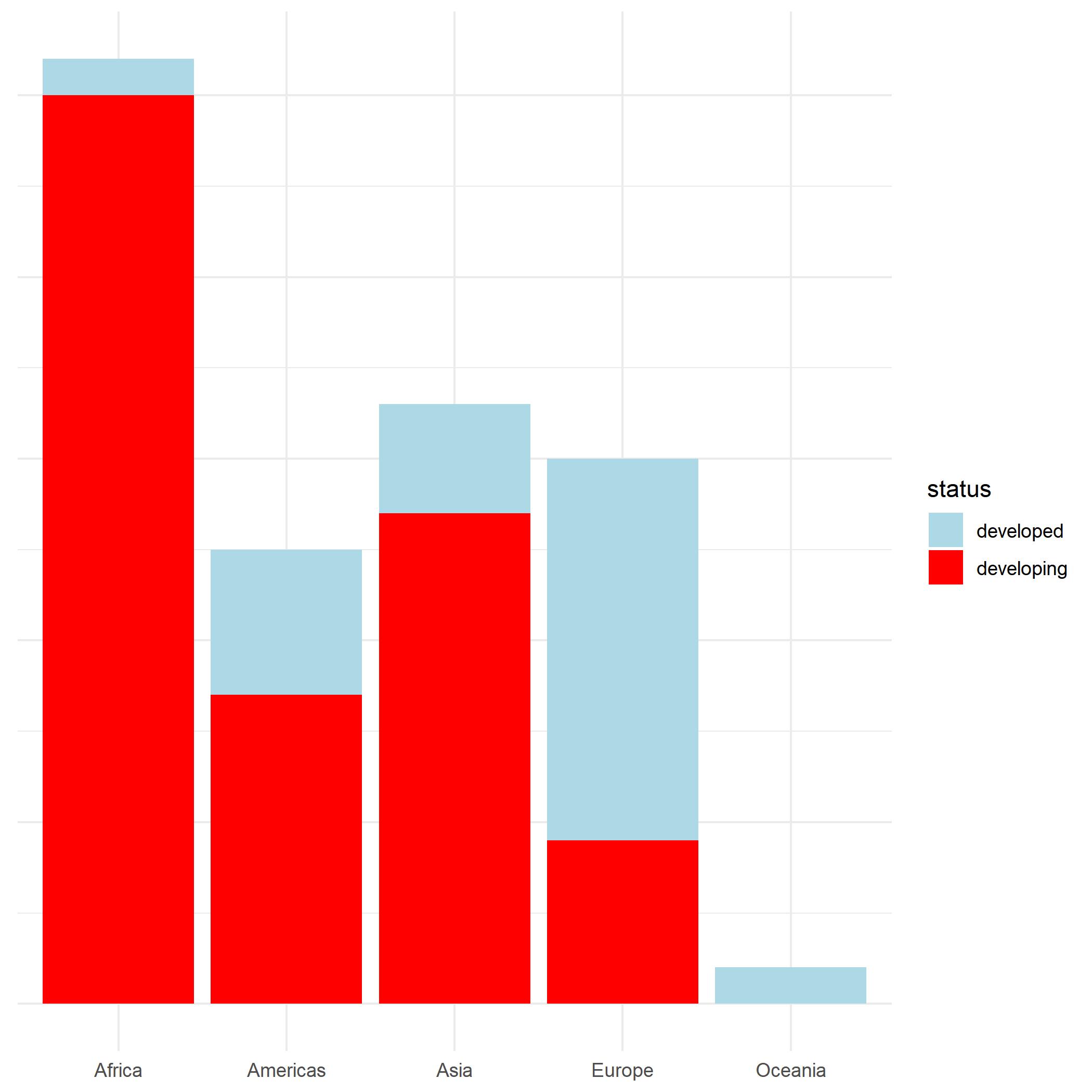
Let’s visualize how many countries are developed and developing in each continent.
gapminder %>%
    dplyr::mutate(status = base::ifelse(gdpPercap < median(gdpPercap), "developing", "developed")) %>%
    dplyr::filter(year == "1952") -> df

ggplot(df, aes(x = continent, fill = status)) +
  geom_bar() +
  theme_minimal() +
  theme(axis.text.y = element_blank(),
        axis.title = element_blank()) +
  scale_fill_manual(values = c("lightblue", "red"))
 |
To add some text to the bars, we have to do some data wrangling first. In addition to counting the number of developed and developing countries for each continent, we also want to count how many countries there are overall in each continent.
df %>%
  dplyr::group_by(continent, status) %>%
  dplyr::summarise(count = dplyr::n()) -> text_status

df %>%
  dplyr::group_by(continent) %>%
  dplyr::summarise(count = dplyr::n()) -> text_overall

ggplot(df, aes(x = continent)) +
  geom_bar(aes(fill = status)) +
  theme_minimal() +
  theme(axis.text.y = element_blank(),
        axis.title = element_blank()) +
  scale_fill_manual(values = c("lightblue", "red")) +
  geom_text(data = text_status,
            aes(y = count, label = paste(count), fill = status),
            position = position_stack(vjust = 0.5)) +
  geom_text(data = text_overall, aes(y = count + 1, label = paste(count)))
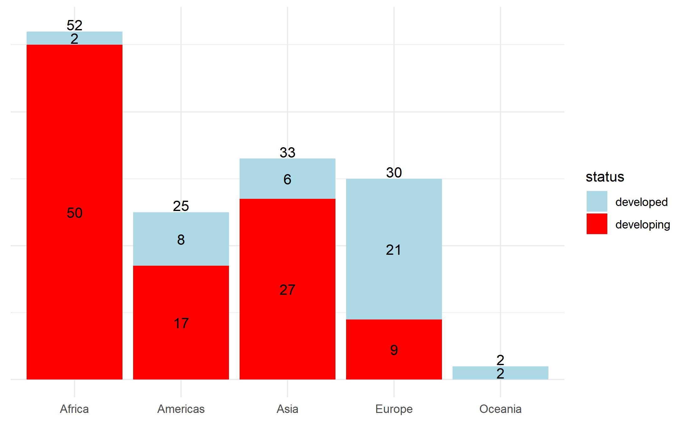 |
You can see above that we added fill = status inside geom_bar and that we had to use two geom_text() functions. The first one displays the number of developed and developing countries, and the second one counts the number of countries in each continent. To place the text above each bar plot, I used count + 1. Because we globally defined x = continent in the ggplot function, we do not have to specify x in the aesthetics layer in the geom_text() functions. Our ggplot() knows exactly where to place our counts on the x-axis. Only for the y-axis, we have to specify y, fill = status, and position = position_stack(vjust = 0.5) for the first geom_text() function and y = count + 1 for the second geom_text() function.
Labeling a Subset of Data in ggplot2 With geom_text()
Next, we only want to label the three biggest countries with the most population.
ggplot(df, aes(x = log(gdpPercap), y = lifeExp, col = continent, size = pop)) +
  geom_point(alpha = 0.5) +
  theme_minimal() +
  guides(size = F) +
  ylab("Life Expectancy") +
  xlab("GDP per Capita")
 |
To achieve that, we have to identify this particular subset first. Again, data wrangling comes first.
df %>%
  dplyr::arrange(desc(pop)) %>%
  .[1:3, ] -> text_size

ggplot(df, aes(x = log(gdpPercap), y = lifeExp)) +
  geom_point(alpha = 0.5, aes(col = continent, size = pop)) +
  theme_minimal() +
  guides(size = F) +
  ylab("Life Expectancy") +
  xlab("GDP per Capita") +
  geom_text(data = text_size, aes(label = paste(round(pop / 1000000, 0), "Mio")),
            nudge_x = 0.35,
            nudge_y = -0.5)
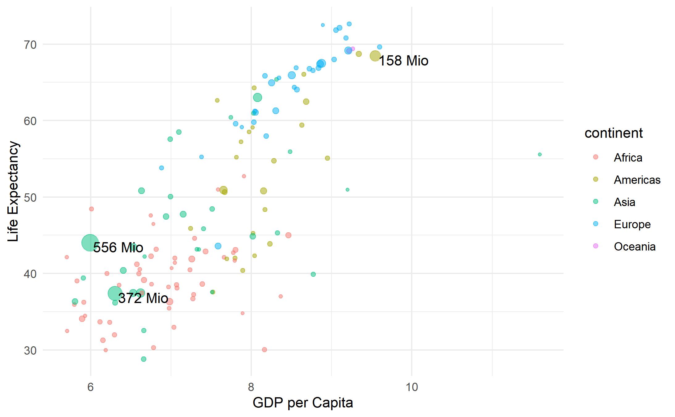 |
In the, we do not need to specify x and y because we already did it globally in theggplot() function. Hence, we only need to provide an argument. nudge_x and nudge_y are responsible for better positioning of our text.
Creating a More Unique ggplot
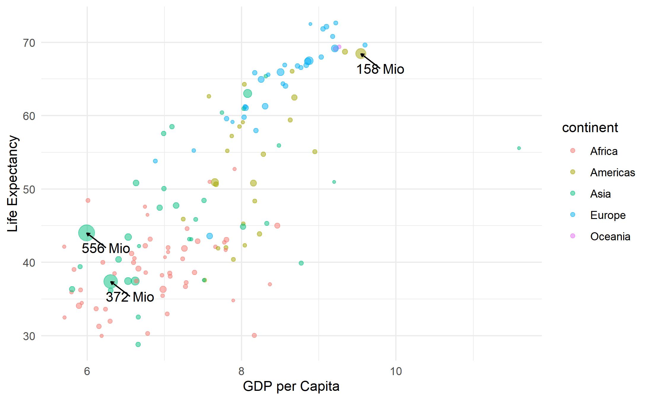
If you would like to add arrows to your, then the code below is one way to do that.
ggplot(df, aes(x = log(gdpPercap), y = lifeExp)) +
  geom_point(alpha = 0.5, aes(col = continent, size = pop)) +
  theme_minimal() +
  guides(size = F) +
  ylab("Life Expectancy") +
  xlab("GDP per Capita") +
  geom_segment(data = text_size,
               aes(x = log(gdpPercap) + 0.25, y = lifeExp - 2,
                   xend = log(gdpPercap), yend = lifeExp),
               arrow = arrow(length = unit(0.1, "cm")), size = 0.5) +
  geom_text(data = text_size, aes(x = log(gdpPercap) + 0.25, y = lifeExp - 2,
                                   label = paste(round(pop / 1000000, 0), "Mio")))
 |
Adding Text at the End of a Time-Series Plot
Again, some data wrangling first.
gapminder %>%
  dplyr::mutate_if(is.factor, as.character) %>%
  dplyr::filter(country %in% c("France", "Germany", "Sweden")) %>%
  dplyr::group_by(country) %>%
  dplyr::mutate(perc = round(((gdpPercap[length(gdpPercap)] - gdpPercap[1]) /
                               gdpPercap[1]) * 100, 0)) %>%
  dplyr::summarise_all(.funs = ~max(.)) -> text

text


## # A tibble: 3 x 7
##   country continent  year lifeExp      pop gdpPercap  perc
##   <chr>   <chr>     <int>   <dbl>    <int>    <dbl> <dbl>
## 1 France  Europe     2007    80.7 61083916    30470.   333
## 2 Germany Europe     2007    79.4 82400996    32170.   350
## 3 Sweden  Europe     2007    80.9  9031088    33860.   297
We identify the countries we are interested in and then calculate how much gdpPercap has increased. We want to keep the most recent year (2007) because we want to add the percentage number at the end of the line graph.
The code looks like that:
gapminder %>%
  dplyr::filter(country %in% c("France", "Germany", "Sweden")) %>%
  ggplot(aes(x = year, y = gdpPercap, col = country)) +
  geom_point() +
  geom_line() +
  geom_label_repel(data = text, aes(label = paste0(perc, "%")))
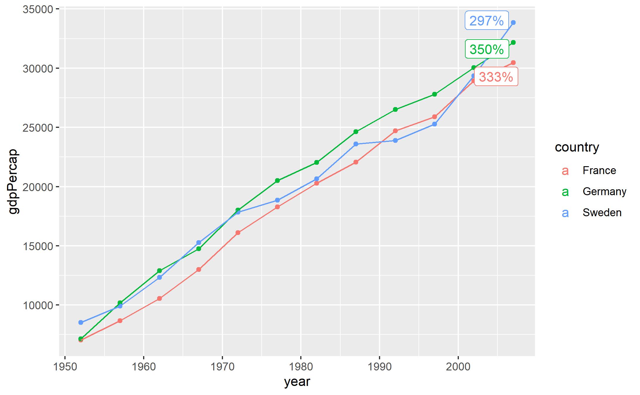 |
We use the ggrepel function geom_label_repel to add labels and automatically make sure text will not overlap.
You notice that we have a weird a in the legend and also the text is colored. This is again because geom_label_repel looks for the aes() layer globally in the ggplot function. Because we have defined col = country in there, geom_label_repel adapts that into its own aes() layer.
To avoid that, we need to specify the aes() layer locally in each geom_ separately.
gapminder %>%
  dplyr::filter(country %in% c("France", "Germany", "Sweden")) %>%
  ggplot() +
  geom_point(aes(x = year, y = gdpPercap, col = country)) +
  geom_line(aes(x = year, y = gdpPercap, col = country)) +
  geom_label_repel(data = text, aes(x = year, y = gdpPercap, label =  paste0(perc, "%")))
 |
Now with the geom_text() function and positioning to the right.
gapminder %>%
  dplyr::filter(country %in% c("France", "Germany", "Sweden")) %>%
  ggplot() +
  geom_point(aes(x = year, y = gdpPercap, col = country)) +
  geom_line(aes(x = year, y = gdpPercap, col = country)) +
  geom_text(data = text, aes(x = year + 2, y = gdpPercap, label =  paste0(perc, "%")))
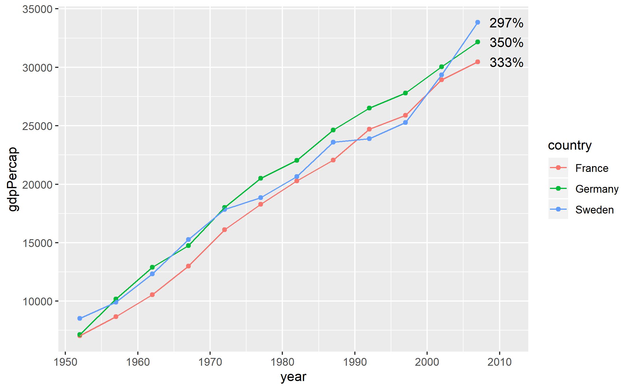 |
If you have questions or feedback about ggplot, let me know in the comments below. Thank you.